
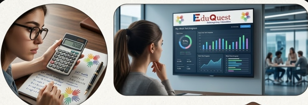
When preparing for the Digital SAT, the difference between a student stuck at 1350 and a top scorer achieving a 1550+ is not raw intelligence or the number of hours spent studying. The true differentiator is how they interpret their performance data. Average students look only at their composite score, while 99th percentile test-takers use a dedicated SAT ranking dashboard to dissect their exact percentile rank, sub-topic error velocity, and millisecond time allocation across every module.
In an adaptive testing environment where questions carry different statistical weights, an SAT analytics dashboard provides the institutional clarity needed to pinpoint weak areas before test day. Powered by the EduQuest SAT Prep Suite and EduPath, this comprehensive guide explains how ranking dashboards work, why percentiles matter for college admissions, how top students track their progress, and how to conduct a forensic walkthrough of your own SAT performance data.
Track Your Global SAT Ranking with EduQuest AI
View Your SAT Ranking
AI Percentile Telemetry
Simulate the Digital SAT and benchmark your performance against 10,000+ global test-takers with instant percentile rankings.
View Your SAT RankingFree Mock Test Hub
Adaptive Test Bank
Access full-length, timed Digital SAT simulations with instant sub-topic heat maps and video explanations.
Explore Mock HubPersonalized SAT Roadmap
EduQuest EduPath Platform
Map your 8-week testing calendar connecting diagnostic baselines, practice drills, and milestone mock tests.
Launch EduPath RoadmapWhat Is an SAT Ranking Dashboard?
An **SAT ranking dashboard** is an advanced psychometric analytics platform that goes far beyond the basic score summaries provided by traditional prep books. Rather than simply displaying "Math: 680, RW: 650," a modern ranking engine tracks four layers of diagnostic telemetry:
Fast-Track Your College & Career Strategy
Get immediate, personalized AI insights tailored to your grade, strengths, and dream universities — 100% free with instant reports.
Know Your Personality Type for Free
Take our 18-question AI psychometric test to uncover your cognitive archetype, hidden learning superpowers, and ideal university courses.
Personalized Career & University EduPath
Build a step-by-step Grade 8–12 admissions blueprint with AI-matched target universities, exam schedules, and extracurricular profiles.
1. Global & Cohort Percentile Benchmarking
Compares your scaled score against thousands of active test-takers globally, showing exactly where you rank among applicants targeting Ivy League, Top 20, and Top 50 universities.
2. Multi-Stage Module Routing Telemetry
Analyzes your Module 1 accuracy percentage and confirms whether your pacing safely unlocked the high-scoring Hard Module 2 track.
3. Per-Question Speed & Chronometer Analytics
Tracks the exact seconds spent on every question, highlighting hesitation spikes (>90s) and flag-for-review conversion rates.
4. Sub-Domain Accuracy Heat Maps
Breaks your performance down across the 8 core SAT domains (Algebra, Advanced Math, Problem-Solving, Geometry/Trig, Craft & Structure, Information & Ideas, Standard English, Expression of Ideas).
Why Percentiles Matter for Top Admissions
University admissions officers evaluate SAT scores in the context of **national and user percentiles**. Understanding the percentile distribution helps you set realistic score targets for competitive institutions:
| SAT Score Range | National Percentile | Admissions Competitiveness | Primary Target Universities |
|---|---|---|---|
| 1550–1600 | 99th+ Percentile (Top 1%) | Ultra-Competitive | MIT, Harvard, Stanford, Princeton, Oxford, Cambridge |
| 1500–1540 | 98th–99th Percentile (Top 2%) | Highly Competitive | Columbia, UPenn, Duke, UC Berkeley, Cornell, Imperial College |
| 1400–1490 | 93rd–97th Percentile (Top 7%) | Very Strong | NYU, UCLA, Michigan, Georgia Tech, King’s College London |
| 1300–1390 | 86th–92nd Percentile (Top 14%) | Solid Candidate | Boston University, UIUC, Purdue, University of Toronto |
| 1200–1290 | 74th–85th Percentile (Top 25%) | Above Average | Penn State, Rutgers, Ohio State, University of Sydney |
How Top Scorers Track Progress
Students who score in the top 1% use their **SAT percentile dashboard** through five structured analytical habits:
1. Monitoring the 3-Mock Rolling Average
Top scorers never celebrate a single high score or despair over an off-day. They track a weighted 3-mock rolling average to eliminate statistical noise.
2. Auditing Desmos vs Algebraic Efficiency
They check their dashboard to ensure that over 40% of Math questions were solved in <25 seconds using Desmos regressions and sliders rather than slow manual algebra.
3. Tracking the "Hesitation Index"
They isolate questions where they took >80 seconds but still got the answer wrong, identifying concepts that require fundamental theory review.
4. Logging Error Classifications in Real Time
Every missed question is immediately tagged into the dashboard’s dynamic Mistake Log (Concept Gap, Time Pressure, Misinterpretation, Careless Slip).
5. Testing Error Mastery with 1-Click Retests
Before taking their next full mock, they complete a targeted re-test of their previous Mistake Log queue to ensure a 100% resolution rate.
Using Rankings to Identify Gaps
When you compare SAT scores on a ranking dashboard, your performance heat map instantly reveals the distinction between a **knowledge deficit** and a **speed deficit**:
| Diagnostic Symptom | Dashboard Indicator | Root Cause | Prescription Strategy |
|---|---|---|---|
| Consistent Sub-Topic Errors | <60% accuracy on Circle Equations or Transitions | Underlying theoretical rule or formula unknown | Pause full mocks; complete 20 focused topic drills |
| Late-Module Collapse | 100% accuracy on Q1–15; 30% accuracy on Q16–22 | Cognitive fatigue or pacing bottleneck in early questions | Implement Two-Pass strategy; flag questions in <20s |
| Careless Grid-In Slips | Right methodology but wrong numerical response | Rushed mental arithmetic or negative sign drop | Double-check all free-response questions with Desmos |
| Passage Re-Reading Fatigue | Taking >100s on Information & Ideas questions | Reading passages passively without pre-identifying main claim | Practice active reading and aggressive answer elimination |
Sample Dashboard Walkthrough
Here is what a complete diagnostic walkthrough looks like on the **EduQuest SAT Analytics Hub**:

Panel 1: The Executive Summary & Projected Scaled Score
Displays your current composite score (e.g., 1490), section splits (Math: 780, RW: 710), global cohort percentile (98th), and projected test-day score range.
Panel 2: Domain-Wise Performance Heat Map
Color-coded breakdown across all 8 domains (Green: >85% mastery, Yellow: 70–84%, Red: <70% priority remediation).
Panel 3: The Chronometer & Time Allocation Timeline
Visual bar chart showing exact seconds spent per question versus global top scorer benchmarks.
Panel 4: The Automated Mistake Log Queue
A dynamic queue of all incorrect questions with 1-click access to video explanations and similar problem sets.
The 7-Pillar Digital SAT Master Preparation Cluster
To build a complete 1500+ testing strategy, explore our interconnected cluster of flagship SAT preparation guides:
- 1. Adaptive SAT Mock Test vs Official Bluebook Test: Which predicts your real score better and how multi-stage routing algorithms work.
- 2. Can SAT Mock Tests Predict Your Real SAT Score?: Top-scorer correlation data and the weighted 3-mock forecasting formula.
- 3. How Many SAT Mock Tests Should You Take?: Calibrate test volume for 1400+, 1500+, or 1550+ scores with our 8-week schedule.
- 4. SAT Topic Tests vs Full-Length Mock Tests: How to balance 25-minute modular topic drills with 2-hour adaptive simulations.
- 5. Why Your SAT Score Is Stuck: Use Mock Test Analytics to Break Through: Overcoming score plateaus with 4-tier error logging.
- 6. Bluebook Practice Test vs Real SAT: 7 Differences Students Must Know: The definitive reality check on difficulty, timers, and test-day shock.
- 7. SAT Ranking Dashboard Explained: How top percentiles use ranking dashboards and telemetry to secure Ivy League admissions.
How EduQuest Powers Your SAT Score Growth
At EduQuest, our standardized testing ecosystem delivers full-scale simulation tools and personalized mentorship:
- 1. 15+ Adaptive Full-Length Digital SAT Mocks: Pixel-perfect replica of the official Bluebook testing engine with calibrated Module 2 curves.
- 2. Instant AI Heat-Map Diagnostics & Ranking: Granular sub-topic performance reports, cohort rankings, and millisecond time-tracking.
- 3. 1-on-1 Mentorship with 1550+ Top Scorers: Expert coaches who analyze your ranking dashboard and assign targeted drills between mocks.
Frequently Asked Questions (FAQ)
What is a good percentile rank on the Digital SAT?
A percentile rank of 90th+ (1350+) is competitive for top 50 universities, 95th+ (1450+) is strong for top 25 universities, and 99th+ (1530+) puts you in the top 1% globally for Ivy League and elite institutions.
How does the EduQuest SAT ranking dashboard calculate my percentile?
The dashboard benchmarks your raw accuracy, Item Response Theory (IRT) difficulty parameters, and scaled section scores against our verified database of over 10,000 global student mock and official exam results.
How often should I check my SAT ranking dashboard?
Review your dashboard after every full-length mock test and weekly topic drill session to update your Mistake Log and track error resolution rates.
Is the EduQuest SAT Ranking Dashboard free to use?
Yes! EduQuest offers free full-length adaptive Digital SAT mock tests with instant access to the AI ranking dashboard and diagnostic reports.
Download the Official SAT Progress Tracking Sheet & Percentile Matrix
Get instant access to EduQuest’s dynamic Excel & Google Sheets SAT Progress Tracker with automated percentile calculators, sub-topic error heat maps, and score forecasting charts.
View Your Real SAT Ranking on EduQuest AI Today
Join thousands of ambitious students who used our ranking dashboard to break their score plateaus and achieve 1500+ on the Digital SAT. Take your free adaptive mock exam now.